


Trends
The best 2022 color trends for decoration

Before we start talking about the 2022 trends, have you heard about the colors of the next year? For those who are not yet so familiar with the subject, the colors of the year are the trend bets in decoration and fashion and can have several palettes considered as such. For you to understand well the subject, we've brought everything well explained, keep reading:
Who decides the color of the year?
Generally speaking, every year, the most famous and trusted paint companies release their bets or palettes for the year, so you can find what you like best and see these colors appearing in stores and homes. For example, Pantone released four different palettes for 2022, while WGSN, Benjamin Moore and ETSY released only one. Sherwin Williams also brought out only one bet.
Bets to color for 2022: check the palettes
As we explained, each famous company brought its own palettes and bets on the 2022 colors. And so that you can explore the one you like the most in this new year that has just begun, we have brought you the three main trends of the year for you to check out:
1. Pantone palettes 2022 color trends

As the most famous paint company, Pantone was the first to create a colour just to bring as the 2022 bet trend. Named as Very Peri, it's a periwinkle shade with a fantastic carefree confident feeling that also brings a great curious and daring inspiration, so it can get a brand new creative spirit and inspire designers. It also brings new visions and a little bit of gratitude within the mix of modernity and the digital world. So check its palettes:
Balancing Act
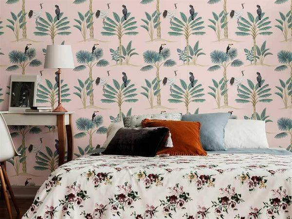
Focused on bringing a natural balance of warm and cool tones, Balancing Act is a complementary palette, perfect for those who care for liveliness and incredible vibrancy to their decor. You can take these wallpapers as an example, as they bring some similar color found in the palette.

The "Pink Leaves" Wallpaper and the "Pink Birds" bring similar tones with the Lotus Patone pink, the Hawthorn Rose as the purple and a beautiful Granite Green. While the "Orange Flowers" Wallpaper gets a pink pretty close to Muted Clay, an orange shade close to Dried Moss, and purple close to Very Peri.
Wellspring

For those who love green shades, these palettes bring the best to fit purple and pink, as Very Peri.

That's why these colors bring the blend of holistic harmonious with nature infused shades. You can find similar into "Blue Bird Animal" wallpaper, with similar shades of Very Peri, EggShell Blue, Foliage and Chaitea. You can also find Foliage, Treetop, Eggshell Blue and Very Pery at the "Green and purple Botanical Floral" wallpaper.
The Star of the show

These palette are perfect for those whose love the mix between a happy and warm color with neutral classic elegant shades, which bring a fantastic timeless sophistication to your decor.

You can find a similar dynamic at "Purple Flowers" wallpaper based with a close shade of White Sand, with Very Peri and Plaza Taupe. At the same time, you can also find based Cloud Dancer with close Deep Taupe, Petrified Oak, Very Peri and Volcanic Glass at "Pink Candy " wallpaper.
Amusements

For those looking for a cheerful, fun, and spontaneous palette full of confidence and cheerful attitude, sparkling playfulness brings expression and experimentation.

Amusements are the perfect one. You can find these kind of atmosphere and close colors at "Pink and Gold Watercolor Nautical", which brings a dark background mixed with similar shades of Very Peri, Tourmaline, Cronsilk and Fochsia Pink.
2. Benjamin Moore Color Palette for 2022

Now, let's talk about another famous palette, Benjamin Moore's, which brings October Mist as the color for 2022. It is a soft green and quite warm and is quite bright and sophisticated for decorating a home. This also has some complementary shades that fit together very well. You can explore any mix as you like. You can easily play with it, to create an elegant yet warm and cheerful room in a simple way. Also, you can find both warm and cool tones, so anyone can find what they like best.
You can find similar colors at "Geometric Basic" wallpaper with a close Morning Drew into a white background, perfect for those that want to try these trends with small steps. Or you can try "Peach or Yellow Geometric Teens" wallpaper, with colored triangles that have close shades of Mysterious, Pale Moon and Collector's Item.
3. Sherwin Williams Color of the Year 2022

Unlike the other companies, Sherwin Williams Sherwin Williams does not carry a complete palette, in fact they only present the color of the year for 2022 and some shades to match, but not in itself to create a specific palette. In their case, the Evergreen Fog was presented, a very cozy, warm green and yet still in a darker tone, perfect for those looking to bring darker into their decor.

You can find a similar vibe and shade of green into two of our wallpapers, as "White and Pink Flower", with leaves in this shade. On the other hand, you can also try our "Grey Bird Animal", which brings a solid background pretty close to Evergreen Fog.
What did you think of our content about the 2022 color trends? We hope that our post helped you find what you were looking for for your home, you can also go check more about some other bets from other companies. So share this blog with your friends and see you next time!